I'm having a hard time deciding what to do for my final project. Some options I have been consulting with is:
The 2012 Olympics, I'm not a huge fan of their current logo and I felt I could possibly make a better one that wasn't so geometric.
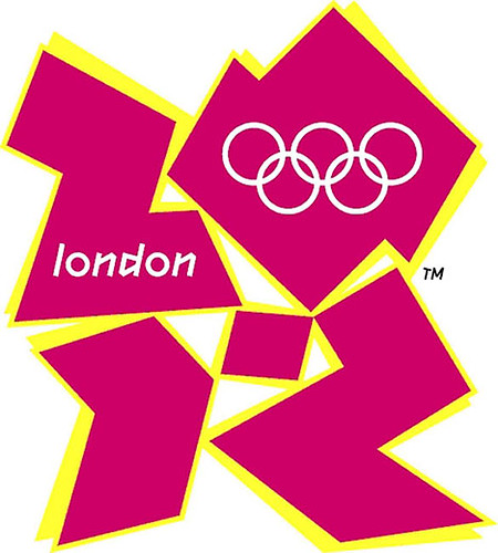
But now I am realizing that it is just a huge franchise and has so many things that go along with it other then a good logo. Plus I found that there are already really good logos out there that they could have used but didn't like this one:
That's when I decided I should go with a theme or idea that I'm more interested in personally. So I have the concept of making an Organization company who supplies organizing and cleaning supplies but is mainly a hireable company that will come and clean up and organize your space.
Some names I have so far are clutterfree, BINS, unclutter, cleanspace, or org.a.nize. this company would manage not only your living spaces but could organize your desk and pantry. It opperates on making your living space livable and systematized so that you have an uncluttered environment.
Wednesday, March 23, 2011
Monday, March 14, 2011
Land O Lakes
In researching the Land O Lakes logo and company I wanted to get their background, so I went to their family website and did a little digging.
Our Heritage
In the early twenties, a cooperative was formed that had new ideas about producing butter. In those days, most butter was made from sour cream and was sold in tubs. This new cooperative made butter from fresh, sweet cream and sold it in pound packages with individually-wrapped sticks. It soon set the standard for butter quality and helped to implement grading regulations for the industry. This cooperative was Land O'Lakes. Now, nearly a century later, Land O'Lakes continues to set the standard for quality, creating products that represent simple goodness, while making the cooking and baking process easier and more enjoyable.
A few things about the logo:
they used a droste effect (An image exhibiting the Droste effect depicts a smaller version of itself in a place where a similar picture would realistically be expected to appear. This smaller version then depicts an even smaller version of itself in the same place, and so on.)
The Land O' Lakes Indian maiden holding the butter box was painted in 1928 by Brown & Bigelow illustrator Arthur C. Hanson, who also painted the original Old Style Lager logo. His original art hangs in the lobby of the Arden Hills office and depicts the maiden in a pastoral scene with lakes, pines, flowers and grazing cows in the background. According to Land O' Lakes, the original Indian maiden was "simplified and modernized" in 1939 by Jess Betlach and has undergone many minor modifications since as the enduring logo of the coop.
Subscribe to:
Comments (Atom)


